Elite Rides
Renting a car involves contracts, inspections, and trust between strangers. I designed a mobile app for renters and car owners that makes all of it feel simple.
BRAND
Elite Rides
ROLE
UX Design Lead
TIMELINE
2021
WHY DID THIS PROJECT EXIST?
Elite Rides is a two-sided marketplace built on one problem: getting strangers to trust each other with a car. Customers rent vehicles, owners list and lease their own; every touchpoint between them had to earn that trust before it could earn a booking.
Every step of the old process like listing, insurance, inspection, contracts, payment, was paperwork-heavy, slow, and depended on strangers trusting each other. The product needed to bring discovery, verification, paperwork, and payment into one mobile flow that worked for two groups of users with very different needs.
As UX design lead, I owned product structure, information architecture, end-to-end flows, and the mobile UI.
.png)
Before: four paper-based steps, handled separately. After: one mobile flow.
WHAT WAS HARD ABOUT IT?
01.
Two user groups with different priorities in one product, without confusing either
02.
Operationally heavy tasks (inspection, contracts, payment) on a phone screen
03.
Trust-critical moments that had to stay transparent without slowing conversion
THE TENSION
The easy call was to hide fees and restrictions until the last screen: less friction up front, fewer people bailing before they pay. That was the product side's instinct: they were measured on conversion and worried an extra screen before payment would cost bookings.
I pushed the other way: full contract, costs, and restrictions visible before the payment button, not after. In a marketplace where strangers hand each other car keys, trust had to come before conversion, even if it cost a step in the flow.
The obvious move
HIDE FEES UNTIL THE LAST SCREEN
What I decided
SHOW FULL COSTS BEFORE PAYMENT

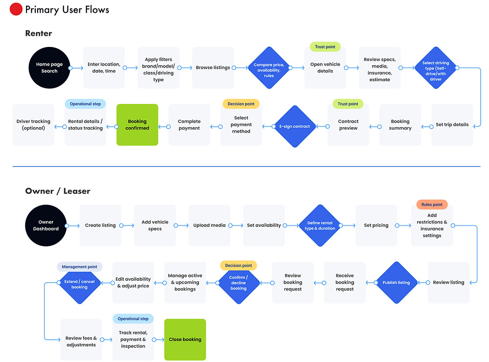
From the actual renter flow: contract preview and e-signature come before the payment step, not after.
WHAT DID I DECIDE AND WHY?
DECISION 01
Two role-based journeys
THE PROBLEM . “Rent a car” and “lease your car” in one app risked confusing both audiences from the first screen.
MY DECISION . Split navigation into two journeys: “I want to rent” vs. “I want to list my car”, with content, forms, and empty states tailored per role.
WHY IT WORKED . Reduced cognitive load and made the platform understandable from the first interaction. Splitting early beats compromising one interface.
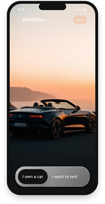
One entry, two journeys: each role only sees its own path.

DECISION 02
Hotspot damage inspection: The one feature every renter and owner interacts with before handoff.
THE PROBLEM . Damage disputes are where peer-to-peer rental trust collapses; word against word, no shared record.
MY DECISION . Photo upload with tap-to-mark damage points on a vehicle diagram, time-stamped and locked from editing, built for one-hand mobile use. Pre-existing damage visible to renters before acceptance.
WHY IT WORKED . A shared, trustworthy record of every handover; ambiguity removed exactly where accountability matters most.
DECISION 03
Contract before payment
THE PROBLEM . Terms, fees, and liability hid behind the pay button, exactly where trust-sensitive users abandon.
MY DECISION . Full contract preview with readable term summaries and e-signature gated before payment; rules, restrictions, and total costs visible upfront.
WHY IT WORKED . Trust first, payment second: visible terms reduced abandoned checkouts and set expectations before commitment.


DECISION 04
Frictionless checkout with visible rules
THE PROBLEM . Reducing friction usually means hiding costs and restrictions; which destroys the trust this product depends on.
MY DECISION . Upfront pricing and fees, card as the default payment method, with bank transfer and Bitcoin tucked behind a "more methods" option, and real-time status banners at every step.
WHY IT WORKED . Completion improved while rules, costs, and next steps stayed fully visible.
WHAT HAPPENED?
4 → 1
4 PROCESSES, 1 FLOW
Contract, inspection, payment, and booking; previously separate, paper-heavy steps, unified in one mobile journey.
0
PAPER DOCUMENTS
E-signed contracts, photo-based inspection records, and digital receipts replaced every physical document.
2
USER GROUPS, 1 APP
Renters and owners, with conflicting priorities, served by role-based journeys instead of two products.
100%
TERMS BEFORE PAYMENT
Contract preview, fees, and restrictions always visible before the pay button.
WHAT I LEARNED?
Trust can be designed for: showing contracts, costs, and damage history before checkout converts better than hiding friction. With two user groups pulling in different directions, split the journeys early instead of compromising one interface.
WHAT I'D IMPROVE NEXT?
Shipping the first version surfaced four follow-on needs I deprioritized for launch:
OWNER ANALYTICS FOR PRICING DECISIONS
PROACTIVE FRAUD & RISK SIGNALS
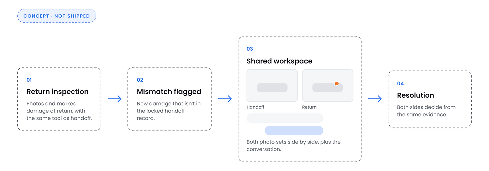
A DISPUTE RESOLUTION WORKSPACE CONNECTING INSPECTION RECORDS & COMMUNICATION
SAVED SEARCH & ALERTS
The time-stamped inspection records from Decision 02 already give both sides the same evidence. The next step is a workspace that brings that evidence and the conversation together when a return doesn't match the handoff.
.png)
PROCESS DEEP DIVE
The decisions above rest on a lot of groundwork. If you want the full research and system detail, it's all here.
PROBLEM FRAMING
Stakeholders had a vision; design needed decisions that reduce drop-offs and support scale.
The structure was built around the core building blocks of the rental process: users, vehicles, listings, bookings, contracts, inspections, payments, driver jobs; so access could be controlled by role and the system could grow without breaking.


The bookings flow through five states: